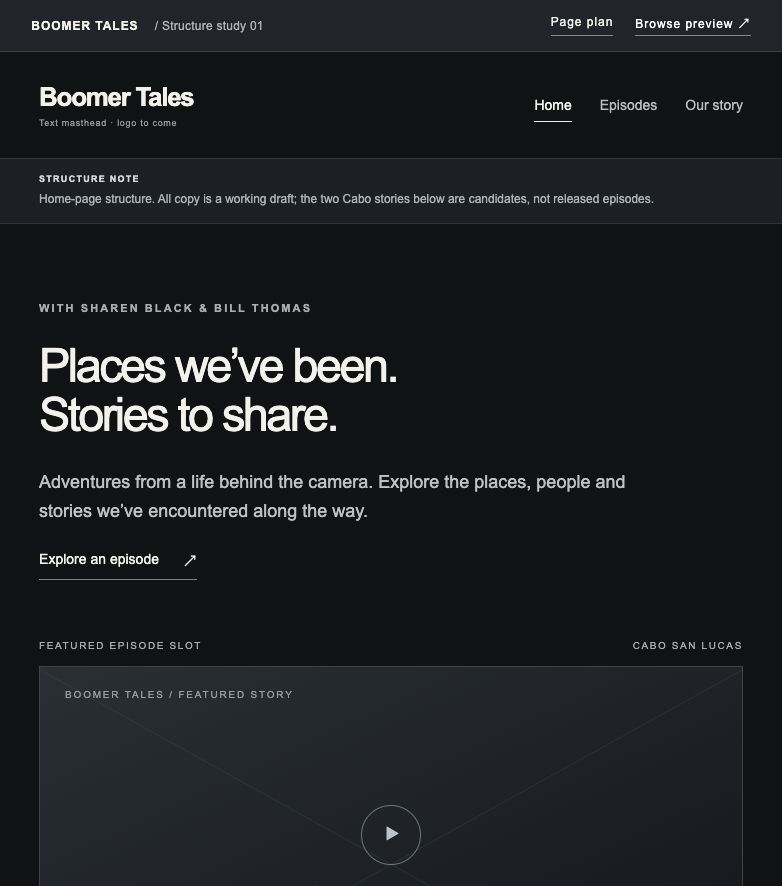
01 / The foundation
Site structure
Explore the page plan, Home, episode collection, individual stories and an optional About page. Focus on what belongs where and how people move through the site.
A place for the ideas to take shape
Sharen, explore how the website fits together, try a visual direction, and compare the logo concepts. Open a study or visit Brand Assets to look around.
Explore the page plan, Home, episode collection, individual stories and an optional About page. Focus on what belongs where and how people move through the site.
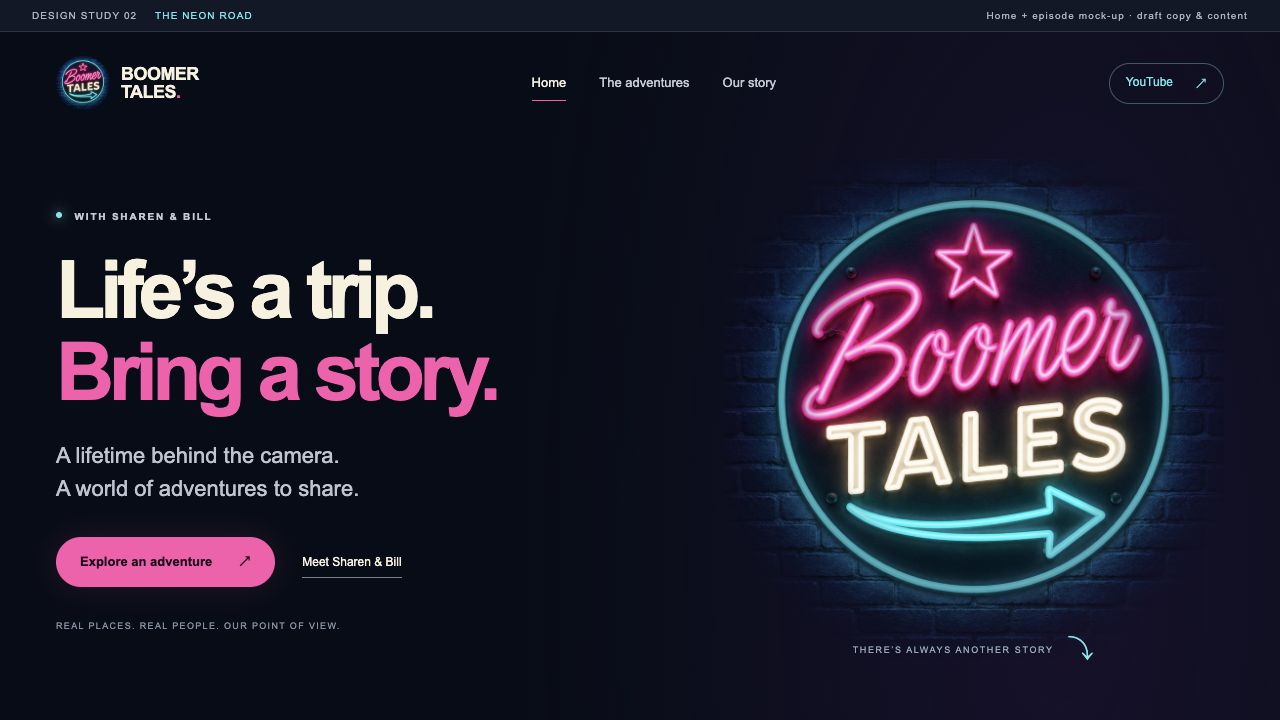
A finished-looking Home and episode study with a dark navy background, cyan and pink accents, and original travel imagery. Explore the layout, color and atmosphere.

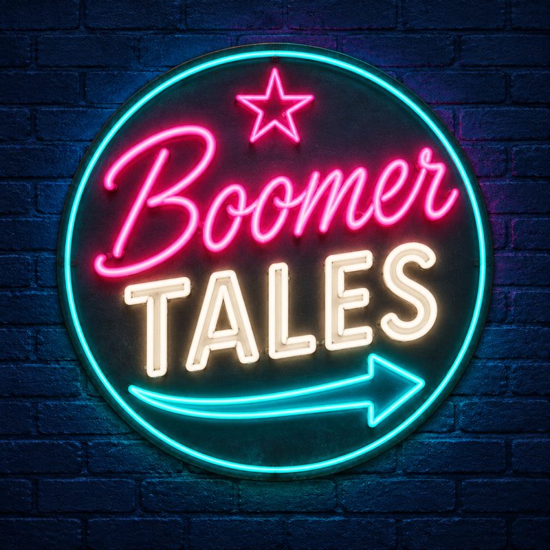

Sixteen initial logo concepts, with full-size views, star ratings and side-by-side comparison. These are ideas to explore together.
Notice what catches your eye, what is easy to find, and what you would change. The phone preview is one continuous, scrollable page with Home and Episode views.
These are working studies. Logo, colors, titles and copy remain open for discussion. Cancun imagery illustrates the neon layout; Cabo remains the starting point for the series. More themes can be added here as we explore them.